
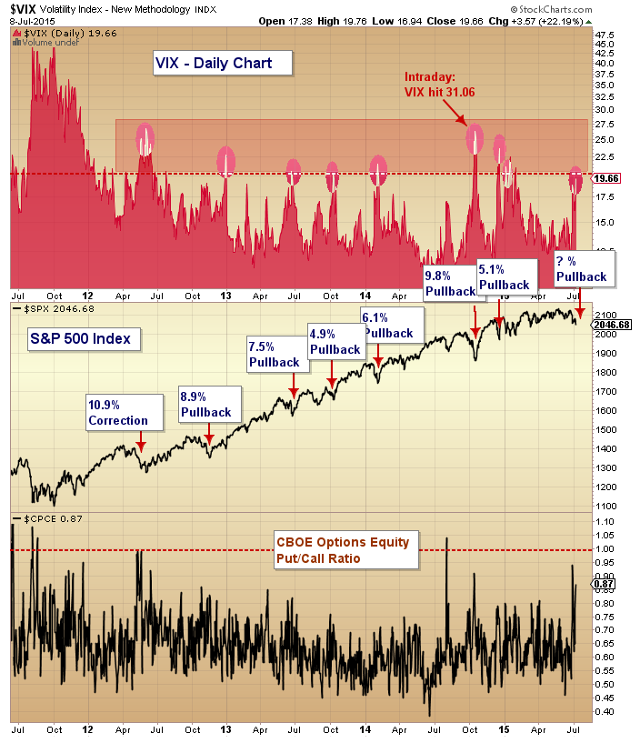
Here is a good chart from Andy Nyquist that looks at recent pullbacks in the SPX and its relationship to the VIX and the put/call ratio.
We created a similar table a while back that shows pullbacks in the SPY of 5% or more since September of 2005 and what the VIX high and low was. The idea is to see at what level “panic” has set in to mark the end of the pullback.
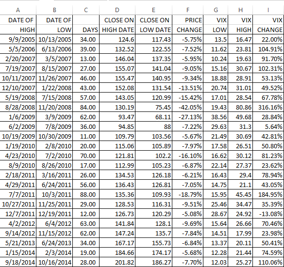
As of today, the last peak in the SPY was on May 21 at 213.50 and the low was on July 8 at 204.53. That is a decline of 4.2%. During that time, the VIX has risen from 12.11 to 19.97 at the close today, a rise of 65%. In our table the average rise of the VIX has been 70.8% and the average high was 30.10, but that includes 2007 and 2008. Just looking at 2012-2014 the average decline was 7.55%, the average VIX high was 22.29 and the average percentage rise in the VIX was 65.90%.